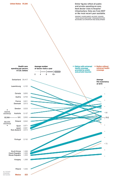
Great post on charting cost and outcomes on healthcare in various countries here..
The New Chart
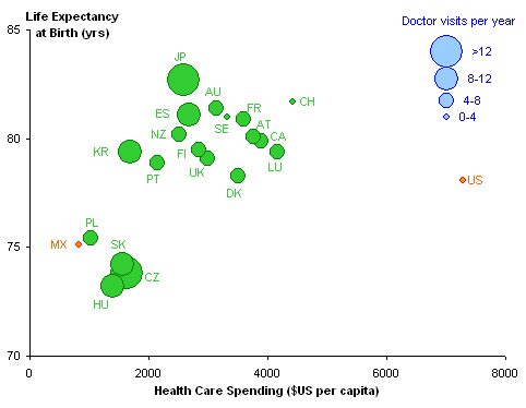
The best way to show correlation between two variables is in an XY chart. I got into Chart Busters mode, and plotted X=spending and Y=life expectancy in the following chart. The US and Mexico are colored differently to highlight their non-universal-coverage status, and data points are sized to reflect the number of doctor visits.


No comments:
Post a Comment